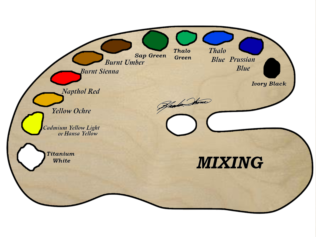
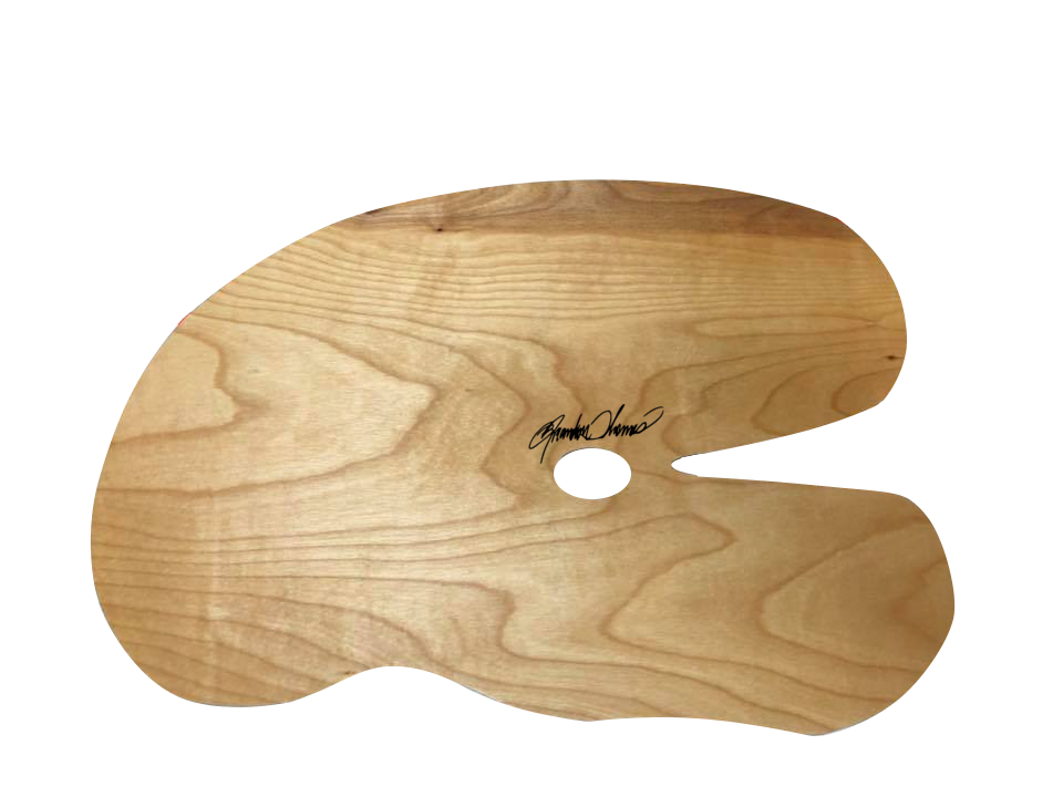
When it comes to loading your palette it can be a challenge. What colors to use? Where to place them? etc.... I have chosen 11 colors that will give me no limits when it comes to my paintings. These are my main 11 colors that will give me what I want on the canvas. In the diagram above you can see the colors I use, and where I place them on my palette. It goes from dark to light. I place my colors in the same spot every time I paint so I know exactly where my colors are. This helps when the creative energy start powering up. I don't have to think where my colors are, because I have the muscle memory where every color is. I recommend you do the same. Now the colors I use: Titanium White, is a very opaque and rich white. Its perfect for mixing, adding highlights to mountains, rocks, and because of its opaqueness it works the best for seascapes. Yellow, Now you will see 2 different bright yellows listed on my palette, Cadmium Yellow Light and Hansa Yellow. Either one will work great and I have either one on my palette for 99.99% of my paintings. They are both a great main yellow color. Yellow Ochre, is a great mixing color for toning down colors and gives a great color to foliage. Napthol Red, is the only red on my palette. Its a great standard red. I have moved away from Alizarin Crimson because of its poor lightfastness. This pigment fades fast, and is not a color you want to be using. I have used a lot of alizarin crimson over the years, and have kept using it despite knowing its weakness. Because so many people have this color on their palettes I have kept using it, but its time we no longer use this color even though how much me love it. I have considered adding Thalo Violet to my palette to replace Alizarin Crimson, but Napthol Red (Grumbacher Red) has been serving me very well so I don't have the need for adding that color to my palette for the time being. Burnt Sienna, is a wonderful dark orange/light brown. It has earned its place as a main color on my palette. I find myself reaching for it all the time. It works so good for rust, tree bark, sand, mixing, etc.... its a fantastic color. Burnt Umber, is an overall fantastic general brown color. Its rich, and works so well for mixing, highlighting rocks, trees, barns, etc... Its been on my palette for as long as I've been painting and replaced van dyke brown on my palette years ago. I still enjoy van dyke brown from time to time and still do projects with it, but I don't use it very often. Thalo Blue, who doesn't love the power and thrill of using thalo blue? This is a blue that can get you in trouble fast! A little goes a long way! I love using it for skies, mixing, and seascapes. Its a very tropical blue. Prussian Blue, is my main blue. Its perfect for skies, mixing colors, and works well for just about everything. Its been my main blue for years. Thalo Green, just recently earned its spot as a main color on my palette. Its an amazing color for mixing, adding zing to foliage, and creating amazing seascape, giving a fantastic tone in the water. Ivory Black, a great standard black that all should have on the palette. Its great for mixing, and adding rich darkness to shadows. Sap Green, a standard dark green that's perfect for foliage, and great for water tones in your seascape. This is just a basic overview as to why I chose the colors on my palette and what I use them for. Other colors I use from time to time that's not listed is Cadmium Yellow Orange, Titanium White soft, Ultramarine Blue deep, Cerulean Blue, Dioxazine Purple, Thalo Violet, and Van Dyke Brow. Most the time I use a very limited palette, but with the 3 additions (Yellow Ochre, Burnt Sienna, Thalo Green) I can paint anything I want. You can order the same palette I use here: Brandon Thomas Wood Palette (FREE SHIPPING IN THE USA) (brandonthomasartsupply.com) The oil colors I use is Grumbacher pre-tested oil colors. You can find them here: Pre-tested Professional Oil | Grumbacher Art (chartpak.com) I have also added a printable palette that you can use to print off to help you load your colors and have a color list of what you need.
0 Comments
Today I am writing this blog to answer the many problems I see and hear. Every day someone is picking up the brush for the first time and they have many problems. First of all, we all know of the 2 guys who got this technique started, one guy is very popular and they sell a lot of supplies every year. The problem is both "original" companies don't make the same quality or even the same formula of the products the "original" guys used. What is even worse is the ones who are changing the supplies don't paint or they are just now learning. Tell me, would you want someone to do surgery on you that is just now learning? or would you prefer someone that has been doing it for 10 years successfully? Now the name on the products the "new" guys I mean "old" guys wink, wink, are making might have a name that has been around for 30+ years but the product under the name is not! We're one of the only companies producing art supplies that are designed much in the same way the "original" guys would have used. My mediums are produced to work for oil painting in our technique ( wet-on-wet). That is why the folks who start with us have better success! My brushes are designed for oil painting not painting walls like the other guys who sell their line of brushes. If you want to have success you need the right equipment. We have one of the oldest formulas on the market because it hasn't changed! I created my mediums in 2014 and put them on the market in 2015. You might ask how is that the oldest when the other brand was on the market in the 80's?? that is because the formula has changed about every year since 2014, My medium has stayed the same and actually does its job! My signature mediums are made for our technique. That is why they work! Others are worried more about the marketing term of "non-toxic" than how your painting comes out. That is why their mediums do NOT work! I am worried about how the paintings look if I was worried about toxic mediums I would switch to acrylic or water mix oil paints. I use old school oil paint. The bottom line is just because the name is original doesn't mean the product is! I designed my products because of the "original" companies changed the quality and formulas. I could see the results from their products in my work and I wasn't happy. I want you to have success, that is why I created Brandon Thomas Art and Brandon Thomas Art Supply. Even though my brand/name hasn't been around that long, we have the best supplies for wet on wet oil painting!
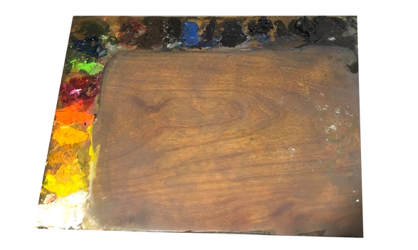
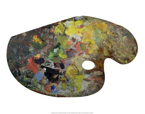
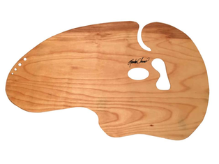
As many of you know my favorite palette is the wood palette, but why? Many folks ask me why not glass, or plastic? Now Glass is a great palette for the lazy artist and I do have a few glass palettes I made for my lazy days :) but the wood palette just has a warmth and personality that glass and plastic just doesn't have. As an artist sometimes its hard to get inspired sometimes, but when you have an old stained up wooden palette it's like an old friend you can see the times you spent working at the easel from the old ghost of paint stains that build a patina over time and it can get the gears in your creative mind moving. People are attracted to wooden palettes, because you can see the artist in the palette from his/her past works and years from now people will look at that old palette and just stare, wondering what painting was created from them old paint stains, or left over paint that wasn't cleaned off etc.. A wooden palette is a masterpiece in its self! I have had many of my old palettes bought from me at art shows because the patina and the beauty it has! Has anyone ever hung up an old plastic or glass palette? Or offered to buy one from any artist? It has no life! A wooden palette at one time was a living tree, and you can see the life in the palette through the grain! Does a plastic or glass palette have that? You might say its distracting etc.. I have never had that problem so I don't know why people think that or claim that . Wooden palettes are a little work but they are worth it! My palettes we build here at Brandon Thomas Art are seasoned like the old masters palettes and will give you a patina overtime and is just beautiful ! Many say that wood palettes suck the oils out of the oil paint, but if its made currently and seasoned correctly you will not have that problem. TOP photo is my old studio palette I made in my wet box. Monet's wood palette! CLICK HERE TO PURCHASE ONE OF MY PALETTESI have been searching for an alternative to Alizarin Crimson over the last year or so off and on. Alizarin Crimson is not a permanent pigment. Alizarin Crimson or the pigment PR83 has a lightfastness of III and means at normal exposer light. (gallery, your studio, your home) it will last about 15- 50 years. Not good! if the painting is in sunlight in the summer it will last 2-5 weeks!! the winter sun it will last 2 - 5 months! Many artist have been recommending this pigment for years since 1868! Many artist still use it, like myself and recommend it!. I started using Naphthol Red in most my paintings to get away from Alizarin Crimson, but Naphthol Red or PR112 has a lightfasteness of II. Much better than Alizarin Crimson and will last in normal lighting for 50- 100 years. In summer sun 6–8 weeks and winter sun 5–6 months so a lot better. I tested rose madder PY3 mixed with PR83. So this paint still had the PR-83 Alizarin Crimson pigment in it and has the same lightfasteness of III, so not a good alternative. Over the last few days I have been tested Thio Violet or pigment PR122. It has a lightfastness of 1 so the most permanent! In normal lighting it will last over 100 years and in the summer sun light and winter light it will last about a year and half. Now we know we don't put our paintings in the sun for maybe a few minutes at a time. To take photos ,move them, display them at an art show that might be outside or if the painting is in front of a window. It will start to fade the pigment. So any mixtures that have the PR83 pigment will start to fade. So your dark mountain or trees will start to fade or anything you use with PR83. Now I don't use van dyke brown because of the same reasons. van dyke brown or PBr7 because it has a lightfastness of III, that is why I use Burnt Umber or PBr7 because it has a lightfastness of 1. Hansa yellow that I also use or PY74 has a Lightfasness of II so Cadmium Yellow Light that I also use is better or pigment number PY35:1 that has a lightfastness of 1. Anything past the lightfastness of II should not be used. I will try and not to use Alizarin Crimson if I can and I think the Thio Violet or PR122 will be the best alternative and it is much nicer! You should also stop using it if you can. Here is a photo of the Thio Violet that is on the left, Rose Madder in the middle and Alizarin Crimson on the right. I mixed the same amounts of Titanium White so you can see the color and strength. If you add a small amount of Burnt Umber or PBr7 it will make it like Alizarin Crimson or PR83. So check your paints pigment numbers and see what the lightfastness is. I gave the numbers to the colors because not all manufactures use the same name, but the pigment number never changes or the lightfastness! If the manufacture of paint you use doesn't have the lightfastess you should switch brands! I also have a photo of the back so you can see the lightfastness info. Check your paints! ~Brandon T! !Over the last few months, we have been getting hundreds of emails about online workshops vs hands-on workshops with an instructor in a classroom. Some people ask about online memberships, DVDs, YouTube videos and online courses. As you know we produce free online videos on YouTube that teach you techniques, tips, and step by step instructions on each project offered. Our videos have helps millions of people all over the world in wet on wet oil painting, but hands-on workshops with a trained instructor are even better. You get help with holding the brush, you see live examples, and the instructor can show you techniques up close. If you're looking for an instructor check out find an instructor page to find one of our trained instructors or click the workshops link to take a class with Brandon. The YouTube videos are great if you can't find an instructor in your area or just want extra help. Brandon's book is also another wonderful way to learn if you want extra help or can't find an instructor. Online memberships can cost hundreds if not thousands of dollars for videos that show you small amount of techniques so you have to buy the next course. You find more techniques on our YouTube channel for free! We recommend finding an instructor in your area if you can because you will learn more faster. Don't listen to the people telling you that live workshops are a waste of money because it's just lies. The same people who are telling you that hands-on workshops are a waste of time and money are selling membership packages. Also, the same people used to have instructors but kicked them to the curb to make more money. Can you say hypocrite? We're here to help you learn this amazing technique and not trying to take your money. That is why we offer free videos and have instructors that will teach you techniques hands-on. In conclusion, You will learn more in live workshops than you will in a full membership or online course. Online classes like our free videos are great if you can't find an instructor in your area or if you want extra help. If you want to learn more faster take a live workshop! Click here to see our trained instructors or click here to take a class with Brandon.
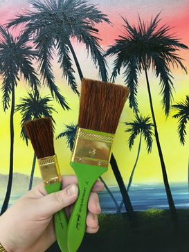
Over the last few years, I have been designing and manufacturing artist tools, equipment, mediums and other supplies for the wet on wet painting technique. Over the last few years, I have always looked at how I can make my supplies the best! that means I am always putting my products to the test to make them better. When I started designing and manufacturing supplies It was for myself and not to sell. I was tired of the supplies on the market and how the price would go up and the quality would go down! I started working with a company in 2009 and over the years I tried my hardest to make the product and the company the best. In 2014 after 5 years. I had enough! No longer was I going to work for a company that didn't respect the customer and the work I was doing to make them better! After a few months of leaving, I started designing supplies for myself because the products that were available were just not working! First I designed my mediums, after several formulas, I hit the nail on the head when I discovered the secret to what makes mediums work! After using the mediums and using them in my workshops, my students wanted the same mediums I was using so I started selling local and then I decided to bring this medium to the worldwide market almost 1 year later. That medium was Amazing White and is still the same formula from 2014 when I mixed up the first jar in my studio. The success of that medium brought many other great mediums that artist love today! The same year of 2014 I started looking into manufacturing my own brush line and working with many manufacturers designing many models of brushes. I went through over 20 different styles of each brush that is in my line today! In today's blog, I want to talk about my 1 and 2-inch landscape brushes. When I first started to work on my large brushes I was working with many manufacturers and these manufacturers never produced a large brush of these sizes. The thickness, length, taper and overall size was a challenge because they only produced smaller artist brushes. Most of our competitors sell hardware brushes and basic stock brushes that were painted or stained and custom stamped with their name and or logo. The problem with this is the taper and balance of the brushes are made to paint flat walls, and not to create textures and other effects we need in our paintings. Also, many of the large brushes today are mixed with synthetic fibers to cut cost. So, if the companies are cutting cost why are they raising the price? easy! most art companies today are powdered by marketers! not artist! and this is a big problem! After 2 years of testing many brushes, I finally got the perfect set! Yes, 2 years!!! After a year of my brushes being on the market, I wanted to jump back into the designing of my brushes. Taking a closer look at how I can possibly make my brushes better! I tested each one and became deeper in love with my brushes. (Yes, an artist can love their tools! I know... weird but we're supposed to be!) Do I need to clear this up still? I didn't take my brushes out to a movie or dinner! Okay now, this is getting too weird! lol!!! Okay, let's get serious now! A few months ago my manufacture called me and said they are looking into a new formula of glue and needed help with the new machine that scans the bristles, fans the bristles and then air fluffs them to remove any extra loose bristles! So we tested this new formula of glue and new machine! The brushes that were created blew me away! Bristles came out a little softer, stronger and the shedding was very little! Now keep in mind this a 100% natural bristle brush with NO synthetic fibers to cut cost or shedding! After the machine and new glue formulation was perfect and dialed in... we did a small run of brushes for me to test in my studio and I was just amazed at how perfect these brushes are! Perfect feel not too soft or firm and the shedding was very little! So with that being said..... I have replaced my 1 and 2-inch landscape brushes with a new and improved version!! If you love the old ones or didn't care for them, I know you will really love the new ones! My old landscape brushes were fantastic but the new ones are just beyond perfect! Check them out and my other great brushes here: http://brandonthomasartsupply.com/Brushes-_c_1.html
Everyday folks are looking into art programs so they can start a business teaching classes. Many companies today offer a teacher program that cost hundreds if not thousands of dollars! Today I will go over my BTAI ( Brandon Thomas Associate Instructor Certificate) The BTAI certificate is $100 and you get many benefits! Click here for more info on the BTAI certificate. This program is perfect for a wet on wet oil painter who has experience in this painting method! This program doesn't offer training like the BTCI program. For more info on the BTCI program click here. No other company supports their instructors like Brandon Thomas Art! Join our team and start the business of your dreams!
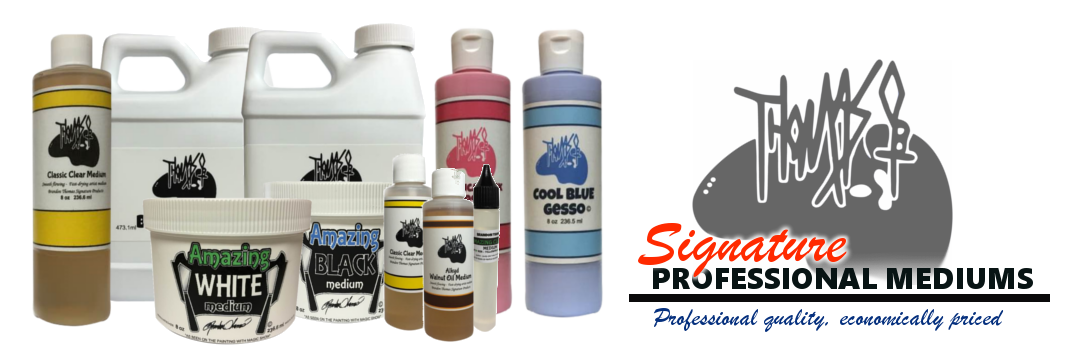
In the past, we talked about, how to paint mountains. Mountains are the biggest topic for any wet-on-wet landscape painter and many people to teach it. But we get thousands of emails every day, people asking for help. We wonder why they have these problems and we get the main reason from asking questions back. The biggest problem we have found is the medium they use. You may ask. why does the medium matter? your medium is the foundation of your painting and at that point controls everything. If your house was built on a weak foundation, your house would have never been finished! So what medium should I use? you need to stay away from pigment mediums that are "solvent" free. Solvent free means it's just oil and pigment. To make the medium fluid it needs a lot of oil. This creates a slick surface that will make it next to impossible to break paint. Such as highlighting mountains, rocks, adding clouds and highlighting foliage. Because your foundation is slick, you will make mud!! Brandon developed his signature pigment mediums ( Amazing White and Amazing Black) He discovered the secrets of what makes a premium medium! and the art companies today who are run by marketers will never discover the secret because they are not a true artist. Years ago the mediums on the market worked great! but something happened. Marketers have seen that folks want NON-TOXIC products and oil painting is full of toxic products. So what does the marketer do? they just add more oil and remove the solvent. BINGO! why didn't the artist back in the 70's think of that, when he created the original pigment medium? because it will NOT work for this technique, It's too slick! OK don't get us wrong non-toxic products are great and if it can be made non-toxic we will find a way to do it. And we did! our pigment mediums are made Non-Toxic and have been since 2015 when Brandon first developed his products. Yes, it's not eatable because of the solvent we use. But the solvent is non-toxic for the use. Meaning the fumes will not hurt you. Our solvent is natural and environmentally friendly and work like a charm! So when they claim that our mediums are a clone or knock off! let us be clear our mediums has been on the market long before theirs. They just put a name on the container that has been around for years. Don't let the name fool you! If you are tired of your paint not breaking switch to our mediums! click here if you found this information to be helpful click like, share so others can get the right info and leave a comment. :)
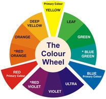
We get this question often. How do you paint a rainbow? Rainbows are probably one of the more easy things you can add to a painting to take an average painting and make it pop! so here is all you need to do. Let the painting dry, once the painting is dry you can add in your rainbow. The only tool you need is a fan brush. You can find high quality fan brushes here: http://brandonthomasartsupply.com/Brushes-_c_1.html next the colors you need are Prussian blue, Hansa or Cadmium Yellow light and Naphthol red or Cadmium red medium. Start by adding a tiny amount of yellow to your fan brush (just stain the bristles) and the dry brush your ark in. Rainbows are translucent menaing you can see through them. So dry brushing you will be able to see the texture and colors behind the rainbow. once you add the yellow go to the red, then the blue. And that's all it is! easy as clicking like at the bottom of this post :) if you liked this tip please share it with your friends! also here is a video on how to paint a rainbow. Have you ever wanted to learn the basics of color mixing? starting with just the primary colors, Blue, Red and Yellow? Some folks think primary color mixing is too hard to learn. But it is very easy! We've had thousands of folks contact us to start a primary colors art program, but we think this information should be FREE! so we are going to start an online painting program for FREE using the primary colors + white. No need to signup for any membership or go through loopholes to get basic information! So here is what the program will cover!
1. 5 paintings using the primary colors. 2. Color mixing tutorial. 3. Color charts. 4. Guide to what you need. 5.Getting started tutorial. 6. Certificate of completion. The program will be available soon so keep an eye out! If you want more information about this program, make sure to like our Facebook page and signup for our email list. We hope you take up this awesome opportunity! |
AuthorBrandon Thomas, CategoriesArchives
August 2021
Categories |
||||||




 RSS Feed
