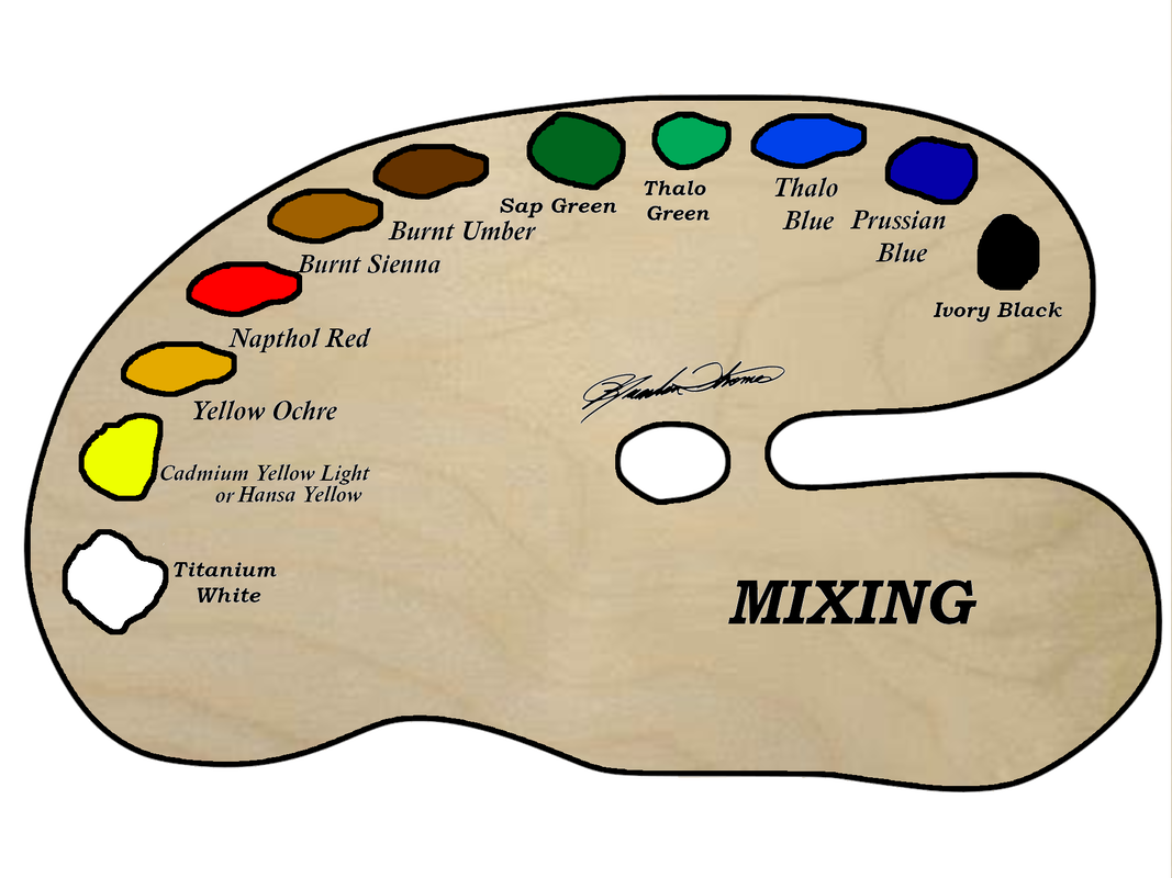
When it comes to loading your palette it can be a challenge. What colors to use? Where to place them? etc.... I have chosen 11 colors that will give me no limits when it comes to my paintings. These are my main 11 colors that will give me what I want on the canvas. In the diagram above you can see the colors I use, and where I place them on my palette. It goes from dark to light. I place my colors in the same spot every time I paint so I know exactly where my colors are. This helps when the creative energy start powering up. I don't have to think where my colors are, because I have the muscle memory where every color is. I recommend you do the same. Now the colors I use: Titanium White, is a very opaque and rich white. Its perfect for mixing, adding highlights to mountains, rocks, and because of its opaqueness it works the best for seascapes. Yellow, Now you will see 2 different bright yellows listed on my palette, Cadmium Yellow Light and Hansa Yellow. Either one will work great and I have either one on my palette for 99.99% of my paintings. They are both a great main yellow color. Yellow Ochre, is a great mixing color for toning down colors and gives a great color to foliage. Napthol Red, is the only red on my palette. Its a great standard red. I have moved away from Alizarin Crimson because of its poor lightfastness. This pigment fades fast, and is not a color you want to be using. I have used a lot of alizarin crimson over the years, and have kept using it despite knowing its weakness. Because so many people have this color on their palettes I have kept using it, but its time we no longer use this color even though how much me love it. I have considered adding Thalo Violet to my palette to replace Alizarin Crimson, but Napthol Red (Grumbacher Red) has been serving me very well so I don't have the need for adding that color to my palette for the time being. Burnt Sienna, is a wonderful dark orange/light brown. It has earned its place as a main color on my palette. I find myself reaching for it all the time. It works so good for rust, tree bark, sand, mixing, etc.... its a fantastic color. Burnt Umber, is an overall fantastic general brown color. Its rich, and works so well for mixing, highlighting rocks, trees, barns, etc... Its been on my palette for as long as I've been painting and replaced van dyke brown on my palette years ago. I still enjoy van dyke brown from time to time and still do projects with it, but I don't use it very often. Thalo Blue, who doesn't love the power and thrill of using thalo blue? This is a blue that can get you in trouble fast! A little goes a long way! I love using it for skies, mixing, and seascapes. Its a very tropical blue. Prussian Blue, is my main blue. Its perfect for skies, mixing colors, and works well for just about everything. Its been my main blue for years. Thalo Green, just recently earned its spot as a main color on my palette. Its an amazing color for mixing, adding zing to foliage, and creating amazing seascape, giving a fantastic tone in the water. Ivory Black, a great standard black that all should have on the palette. Its great for mixing, and adding rich darkness to shadows. Sap Green, a standard dark green that's perfect for foliage, and great for water tones in your seascape. This is just a basic overview as to why I chose the colors on my palette and what I use them for. Other colors I use from time to time that's not listed is Cadmium Yellow Orange, Titanium White soft, Ultramarine Blue deep, Cerulean Blue, Dioxazine Purple, Thalo Violet, and Van Dyke Brow. Most the time I use a very limited palette, but with the 3 additions (Yellow Ochre, Burnt Sienna, Thalo Green) I can paint anything I want. You can order the same palette I use here: Brandon Thomas Wood Palette (FREE SHIPPING IN THE USA) (brandonthomasartsupply.com) The oil colors I use is Grumbacher pre-tested oil colors. You can find them here: Pre-tested Professional Oil | Grumbacher Art (chartpak.com) I have also added a printable palette that you can use to print off to help you load your colors and have a color list of what you need.
0 Comments
Your comment will be posted after it is approved.
Leave a Reply. |
AuthorBrandon Thomas, CategoriesArchives
August 2021
Categories |
||||||


 RSS Feed
